When applying the overlay maps you may need to try a few before you find the most suitable one as they differ in terms of their contrast and colouration. This is because there is a wide variety of colour maps that cover an array of subjects and so in order to cater for everything, numerous overlays are necessary. A picture with a high level of contrast and a more expansive palette will more than likely require an overlay map to match where as a more monochromatic one with a smaller tonal range will beg for the opposite. What follows is a brief example of how the right sort of overlay can make a difference and make for a more realistic and subtle look to your texturing. For the benefit of anyone new to Photoshop there is also a short explanation of how to alter existing maps to get the look you are after.
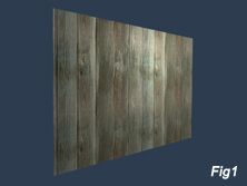
If you look at Fig 1 you will notice that the image is tiled twice in both directions and as a result there are some repeatable patterns such as the knot and red tint along the length of one of the boards.
 
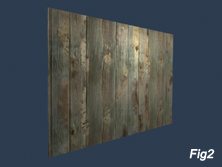
When we apply an overlay we will see how this remedies the problem and makes it look far less apparent as seen in Fig 2. Although we have alleviated it to some degree the overlay is not great as it looks a bit patchy and is at odds with the colour of the wood somewhat.
 
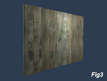
When we substitute this with a different one that is more in tune with the colours of the wood image you can see a more subtle and effective result as seen in Fig 3. There is no reason why either of the overlays cannot be used but as a rule of thumb it is often best to choose a map that has a similar contrast and colouration to the photo in question.
What follows is a beginner's account of how you can quickly alter the overlay maps to suit your textures using Photoshop.
If you look at Fig 4 you will see that the cloth texture has been tiled and uses an overlay map that has a strong contrast and creates the appearance of dirt. It breaks up the image quite well but needs to be a bit more subtle.
If we look at the map (Fig 5) we can see a large tonal range and one that leans towards a red as opposed to a blue palette. What we shall do is reduce the contrast and give the map a bluer colour so it more closely matches our cloth.
Open up the file in Photoshop and then under Select-Colour Range use the colour picker toselect the darker areas as seen in Fig 6. Click OK and then once again choose Select and go to Feather and change the number to 5 pixels. This will effectivley soften the selection boundary.
Then under Image- Adjustments- Colour Balance begin to shift the colour range towards the blue and green areas similar to Fig 7. Once this is done invert the selection area (Select-Inverse) and do the same thing to the rest of the image. You can vary the settings slightly if you wish.
With this done make sure you deselect everything and then go to Image-Adjustments -Brightness/Contrast and reduce the contrast and increase the brightness similar to Fig 8. All that is left to do now is blur the image by going to Filter-Blur-Gaussian Blur and once this is done you can then re apply your overlay and hopefully see a better result.
I made some changes to the map in question and when used on the cloth it produced a far more subtle effect (Fig 9).
These are just a few quick and simple ways in which you can tailor the maps to better suit your needs but ultimately it is a subjective decision and depends entirely on what you wish to achieve.